CONCEPT PROJECT · LUXURY / PREMIUM
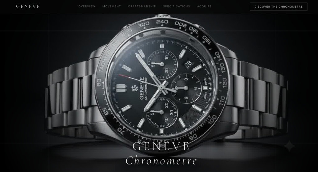
GENÈVE Chronometre
“A fictional Swiss watch brand, built to prove I can design for restraint and precision, not just warmth.”
Project Details
Client
Self-initiated Concept
Role
Design & Build
Tools
Antigravity, GSAP, Framer Motion
Type
Luxury / Premium interactive experiment
Brief
Every project I'd done up to this point asked for warmth — human, approachable, a little playful. I wanted to find out if I could do the opposite: something cold, exact, and expensive-feeling, where every word and every pixel has to earn its restraint. GENÈVE Chronometre is a fictional brand I built specifically to test that — no real client, no real product, just a deliberate stretch into a register I hadn't worked in yet.
The goal wasn't just visual — I wanted to learn scroll-triggered animation well enough to make a watch appear to disassemble as you scroll, piece by piece, then reassemble as the story continues.
Process
I started with the one thing that scared me most technically: the scroll-driven exploded-view animation. Everything else — typography, copy, pacing — got built around getting that moment right, because if that centerpiece didn't feel expensive, nothing else on the page would land either.
From there I worked section by section, treating each scroll stage like its own mini-composition: the hero states the object plainly, the disassembly section pulls it apart to reveal craft, and the movement section slows down entirely to let two sentences of copy carry the whole screen.
See it in motion below
Decisions
Restraint was the hardest part, not the animation. My instinct in most projects is to add a small unexpected detail — like the therapy cat on Astitva — but here, character had to live entirely in pacing and typography, not in a playful element. A luxury brand doesn't wink at you.
I also chose to write the copy the way real luxury horology brands do — short, declarative, occasionally poetic (“A mechanism, not a motor.”) — because the tone had to carry as much weight as the visuals.
Outcome
A fully built, five-section site with a working scroll-triggered disassembly centerpiece, consistent premium typography and pacing throughout, and a genuinely different register from anything else in my portfolio. It's not a client project — it's proof that when a brand calls for cold and exact instead of warm and human, I can build that too.