THERAPY & WELLNESS · REAL CLIENT
Astitva
“A counselling and art therapy practice that needed to feel like a held breath the moment you land on it.”
Project Details
Client
Vishwa (Astitva Practice)
Role
Design & Build
Status
LiveWebsite
astitvapsychotherapy.in →Differentiator
Custom illustrations & interactive inner-child characters
Brief
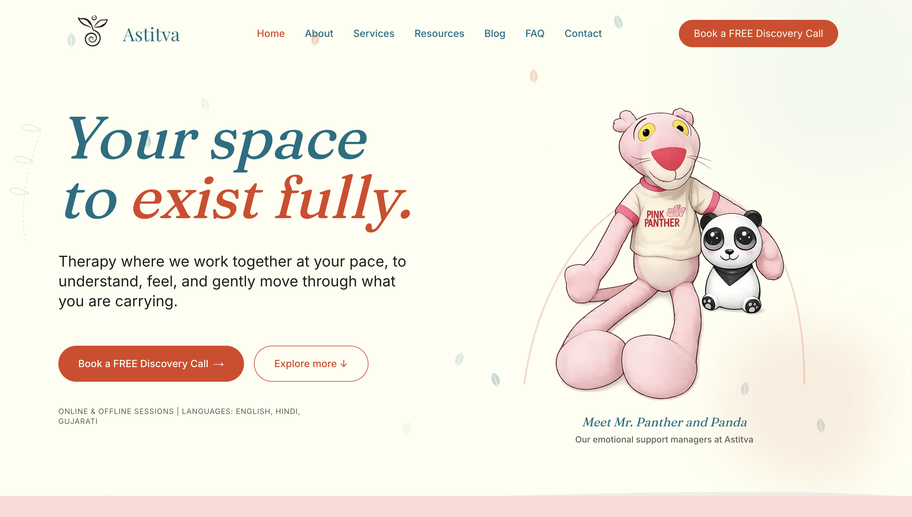
Vishwa runs a counselling and art therapy practice, and she was clear about one thing from the start: the site needed to look cozy and peaceful — clients should feel good and comfortable the moment they open it, before they've even read a word.
She wanted the site to depict what therapy with her actually feels like — warm, unhurried, a space where someone's inner child could feel free enough to just be their real self. That's a hard brief to design for, because “comfortable” isn't a layout decision — it's a feeling that has to come through in every choice, from color to pacing to the small details.
Process
I started with a simple prototype — something real for Vishwa to react to, instead of asking her to imagine it from a mood board. Her first response was clear: she liked the direction, but not the color palette. That's genuinely useful feedback — it told me the structure was right and only the feeling needed adjusting, which is a much smaller fix than starting over.
Once she gave me the palette she actually wanted, I built out a full working version and shared it for feedback before calling anything final. When she approved the direction, I moved into fine-tuning — and that's where I added something she hadn't asked for: the mascots. From there it was rounds of small, honest feedback and refinement until everything felt right to her.
Decisions
The mascots — Mr. Panther and Panda, and later the interactive therapy cat — were my own addition, not part of the brief. Vishwa's language about the practice kept coming back to comfort and inner-child freedom, and I felt the site needed something that felt safe rather than just described safety. A soft, playful character does that in a way that copy alone can't.
The color palette shift she asked for early on was the other key decision point — it's a reminder that “looks nice” and “feels right for this specific person's clients” aren't always the same thing on the first try, and that's fine. That's what the feedback round is for.
Outcome
The site is live. Vishwa came in with just a rough idea of what she wanted — and watching it become something she calls a masterpiece is exactly why I do this work. Her words say it best:
“I loved how it looked. Especially the cat and panther, panda. My clients loved it as well. They loved how cozy it is.”
“All the elements were added very thoughtfully. I came in with just a rough idea — Rahul converted it into a masterpiece.”
— Vishwa